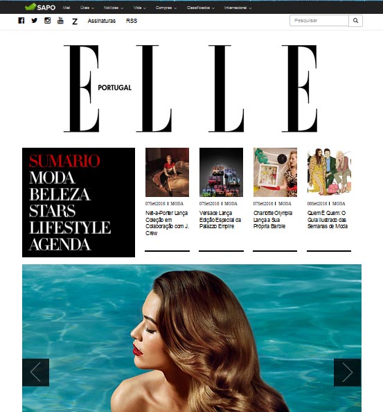
Elle Portugal responsive website in WordPress (a case study)
Nowadays, having a responsive website is essential for any business and Elle Portugal magazine has trusted on Grow Under to update its Internet page to the new reality of the market.
It has been proven that having a website with a responsive design helps to improve sales, according to the digital marketing gurus. That´s why more and more companies bet on creating a single website that fits to all devices, particularly to mobile phones - it´s the easier way to manage it and to profit from it.
Grow Under, Elle Portugal - http://www.elle.pt/ - and Webconcept, a marketing digital company that partnershiped in this project, have shared this challenge to define the magazine´s current website which was developed in WordPress, with a responsive format.
Do you need a responsive website? We can help.
Elle is "the best selling fashion magazine in the world"
Elle magazine presents itself as "the best selling fashion magazine in the world" and is probably the most renowned in the Portuguese lifestyle universe, targeting an essentially female audience. Introduced 28 years ago in Portugal, Elle magazine is intended for independent, refined and elegant women, presenting the latest creations of the great fashion designers and revealing trends of beauty and all the news in terms of passereles and clothing stores.
The mission
Elle Portugal website managers chose Grow Under and Webconcept to adapt their Internet page to the market´s new realities, namely in order to make it responsive.
The goal was to create a web design adaptable to all types of browsers, screen formats and devices, whether computers, tablets or smartphones. This is an increasingly pressing need in a society where mobile communications already have a great importance - accordingly to Anacom data, Internet traffic from mobile phones has increased 55,1% in the last three months of 2015.
The concept pointed to a coherent website with the brand image and to a webpage easy to use, whether the users navigate in their home desks, coffees or beaches. All this without losing access to fundamental content, allowing a complete experience, with total availability of quality texts and images.
Besides the design and structure touch-ups, Elle Portugal also needed to prepare the process of integration in SAPO portal - meanwhile, this migration has already materialized.
WordPress website with responsive design and SAPO integration
Grow Under has implemented the strategy defined with Elle Portugal and Webconcept, developing the website´s structure in WordPress, with a responsive design, and making the necessary technical adjustments in the old page of the magazine.
It was necessary to make an intervention at the CSS level using media queries, and to make changes to adjust the layout and all its elements to the different screen resolutions of personal computers, smartphones and tablets.
Nowadays, this responsive format development is even more important because Google takes "the mobile devices compatibility" into account, as one of the variables to rank sites in searches. So, those who do not adhere to a responsive design are clearly harmed.
Grow Under´s performance was also aimed at adapting Elle Portugal website for integration into the SAPO platform, a process that requires some cares and where the experienced hand of qualified professionals is a gain to surpass every problem in the way.
The final result, after this partnership between Elle and Grow Under, is a website where it is easier and more appealing to browse, with better usability to answer modern women continuous demands, and with more potential to grow among its target audience.

